Basic Color Theory for Fashion Lovers.
Color is a very influential thing in this world. Without colors, the world would not be as beautiful as we imagine. Color can also provide a flow of feelings to human thoughts and feelings. For in the fashion world itself, color theory is very important for any type of design you do. Color can liven up your design or bring it down leaving you with an unsold product. When designing fashion, you’ll be working a lot with color, so it’s important to know which colors work, how to create the colors yourself, and the proper color terminology to use to communicate with others in the fashion industry. Here are some sections on color theory as follows:
Fashion Color Theory – Primary Color Differences
We’ll start with the basics of color theory and its related words. Primary colors are something you may or may not be familiar with. The traditional basic colors taught are Red, Yellow, and Blue. There is some disagreement and argument as to why red, blue, and yellow aren’t really primary colors. Some people like CMYK (Cyan, Magenta, Yellow, and Black, also known as Key), or CMY, as the primary color. You may have noticed that your test printer prints and uses CMYK ink cartridges. Others are still debating RGB – Red, Green, and Blue – as the main trio.
Discussions and arguments about which colors are primary colors are not new. While there is no definitive answer as to which set of primary colors is correct, as a designer you should know that there are different perspectives on color, and understand what the term means. You may be working with or for someone who prefers one master set over another. RGB for example is a good primer when working with light, such as projection and websites/screens. CMYK is a good primer for tangible items like prints/photos.
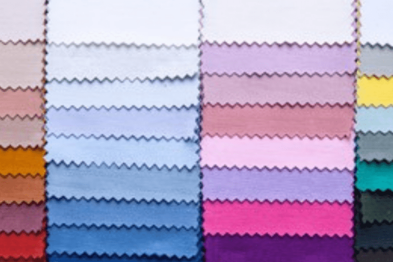
The Most Needed Color Wheel?
Have you ever heard of the color wheel? Maybe some of you are very familiar with this word. The color wheel is a vital tool for fashion designers and is something you will often refer to when choosing and deciding on a color palette for your designs. The color wheel, which is a wheel, or circle, shows the spectrum of colors and their relationship to one another. The standard number of colors on the wheel is 12, although some use up to 24 colors.
In addition to the RYB primary colors (red, yellow, and blue), secondary and tertiary colors also appear on the color wheel. Secondary colors include purple (or violet), green, and orange, these colors are created by mixing primary colors with each other. Mixing primary and secondary colors together produces blue-green, yellow-green, yellow-orange, red-orange, red-violet, and blue-violet – tertiary colors. These 12 colors make up the color wheel.
VST Color – Temperature, Value and Saturation
Have you ever heard of cool colors and warm colors? If you split the color wheel in half, you have cold and warm colors. Green, blue, and purple are the coolest, while yellow, red, and orange are the warmest. Temperature is the term used, so if someone asked you what the temperature of a color is, you would answer either cold or warm. Within the circle itself, blue is the coolest color and orange is the warmest color.
Value is the lightness or darkness of a color. If you hear someone say that a color has a high value, it means the color has a light value and if someone says a color has a low value, it means that the color has a dark value. On the other hand, Saturation is how intense, or pure, a color is. Pure blue is blue with no other colors added.
Hue, Shade, Tone and Mute
Designers can desaturate and create new colors using tints, shades, tones, and mutes. This can make colors softer, lighter, darker, duller, or muted.
Tint = color + white
Shades = color + black
Tone = color + gray
Mute = color + complementary color
Base tones for hues, tones, tones, and mutes can vary depending on the coolness or warmth of white, black, gray, and complementary colors. If you are making a warm orange, it will look better using warm tones.
Introduction to Color Schemes
This color scheme will help you in choosing colors that match each other, there are six common color schemes, namely:
Complementary
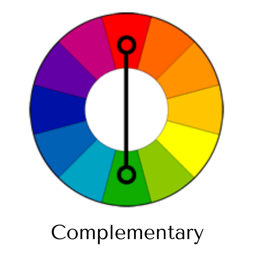
Complements are colors that are opposite from the colors on the color wheel. For example, the complementary color of green is red.
Split Complement
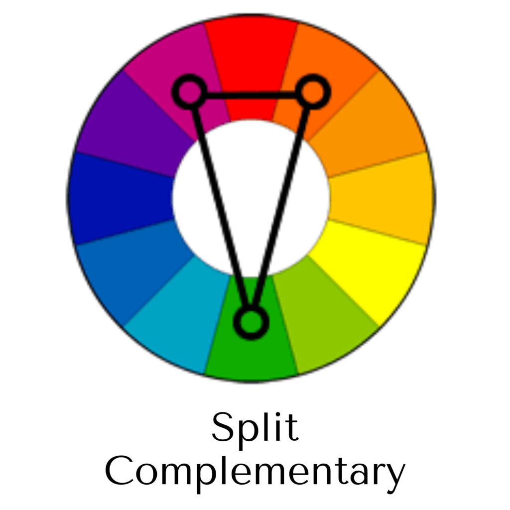
This scheme takes a color and instead of using a complementary color, you use the color next to it. We know that red is green’s complement, so the split complementary scheme is green, red-orange, and red-purple.
Triadic
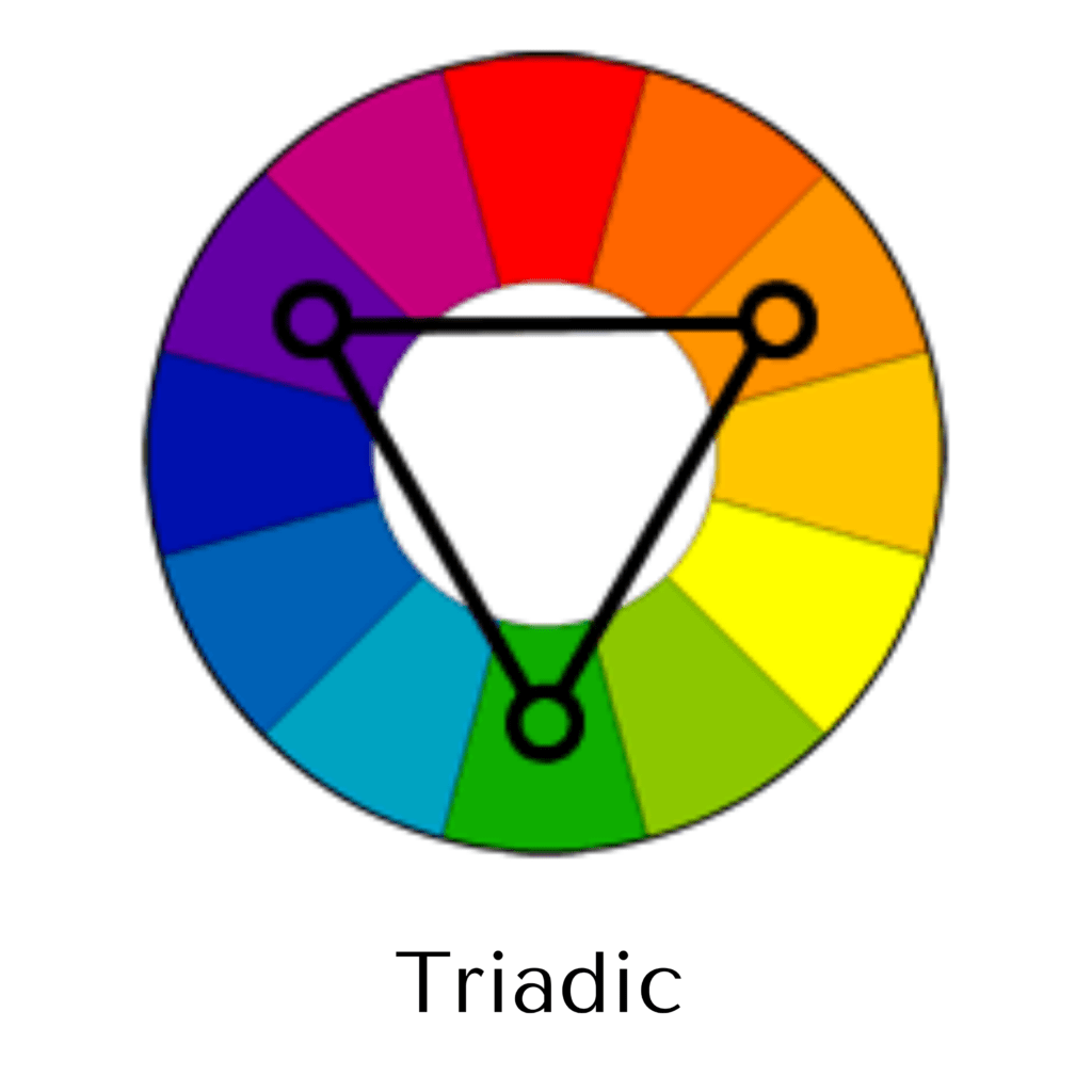
The triadic color scheme is three colors equidistant from each other on the wheel. Blue, red, and yellow are a triadic color scheme.
Tetradic
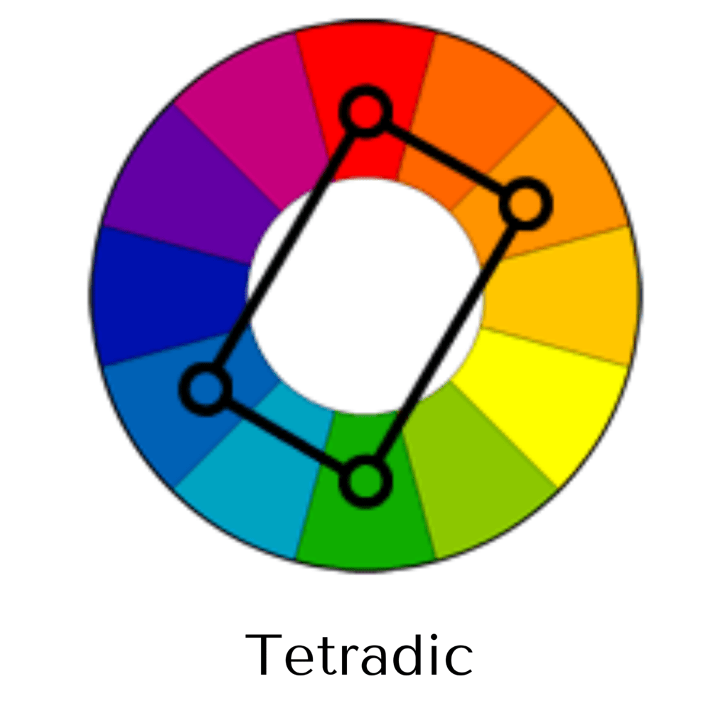
Also known as Square, this scheme uses four colors that are placed evenly on the color wheel.
Analogous
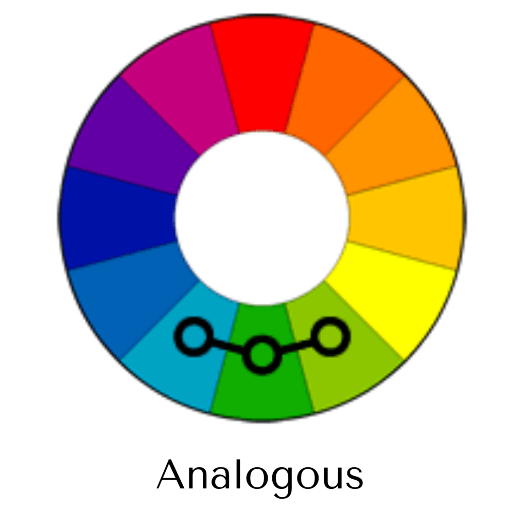
This scheme includes colors, usually three but can be more, which are like colors. Green, blue/green, and blue are analog color schemes.
Monochromatic
This scheme is where one hue is used with variations of a number of hues, tones, tones, and mutes.
This scheme will really help you to know when to choose colors for your designs and communicate with others what you want.
By understanding a little bit about color theory, you’ll be able to better critique your work and see if or why something went wrong. The information above is a good color theory base for you to get started in your designs, especially if you work with fashion illustrator software. One of the best ways to learn more about color theory is to practice mixing colors, experimenting, and have fun creating colors.